CANUCKS 50th CampaignPrint and Layout Design | Digital Design | GIF Animation
—For its 50th Anniversary Season, the Canucks wanted to create a campaign that sought to honour its rich and colourful past, while simultaneously reminding fans of the teams’ current young talent, and incredibly bright future. In order to create a campaign that could feature all eras together, we needed to come up with a colour system that would work when all were in one composition, and still be able to evoke the look and feel of each era despite not being the true colours. As the true colours are too saturated and contrasty which did not look great in juxtaposition. To pair with this dramatic and colourful departure, the typeface families used for this season were Dharma Gothic & Druk Text wide. Dharma gothic is chosen as the glyphs had been designed carefully to be retro-looking to give off a sense of nostalgia while Druk gives off a sense of modernity and represents the future of sports. Both provided a variety of weights that would work across the many mediums we produce.
The visual imagery for the season featured the historic eras and background as duotones, and maintained full-colour image treatment for players and current team members. The intention was to always highlight the new stars while celebrating the past legends. Another element of the campaign was a fan-inspired "tapestry" that featured moments, nicknames, stars past and present alike, woven together with illustrations to be used as a background pattern.
Noteworthy projects include the design and execution of the 2019.20 Gameday Magazines,
50 limited edition player posters, GIF animation, and Wallpaper Wednesday social media feature.
Designed while at Canucks Sports and Entertainment
Limited Edition Poster Design


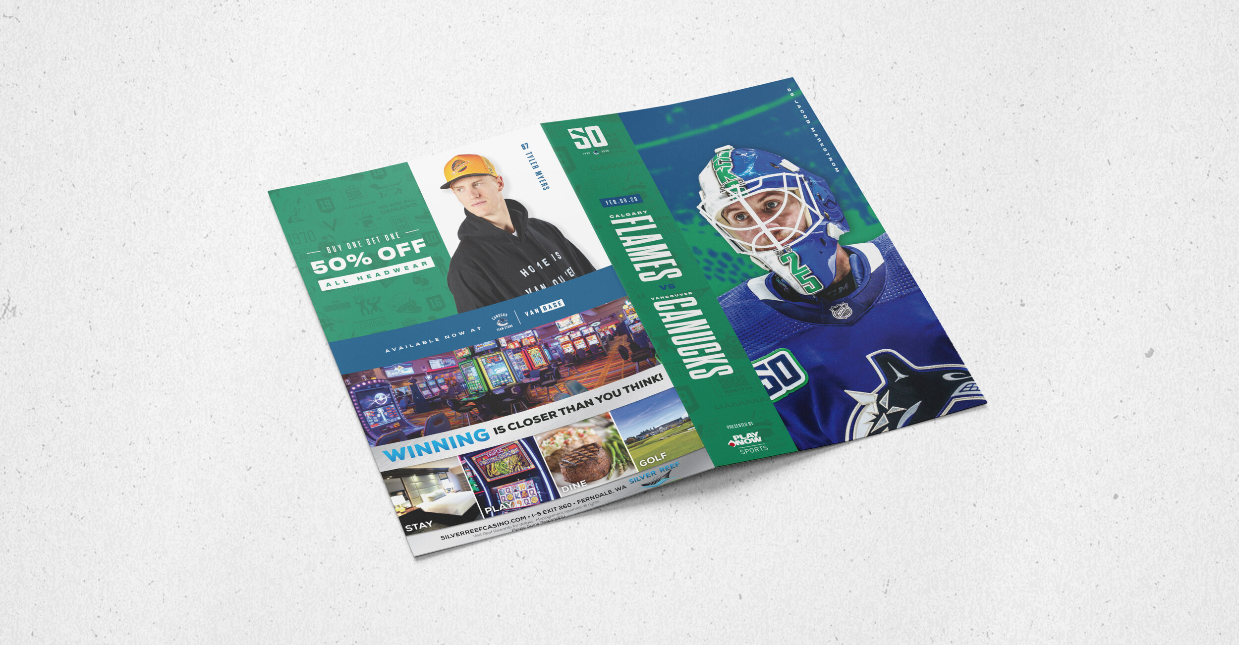
Game Day Magazine Design


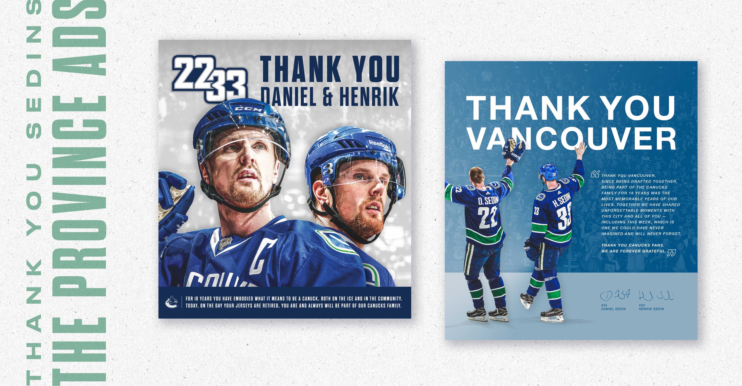
Sedin Brothers Retirement Graphic for Newspaper
Wallpaper Wednesday


