VERA’S BURGER SHACK
Brand Refresh | Store Design | Web Design
—
Student work from Emily Carr
Opened in 1977 by Vera and her husband Frank in West Vancouver, Vera's Burger Shack has been a local favourite since the very beginning. Today, it has grown into a small local chain that still sticks to their principle of freshness and quality by crafting their burgers to order and using top quality ingredients.
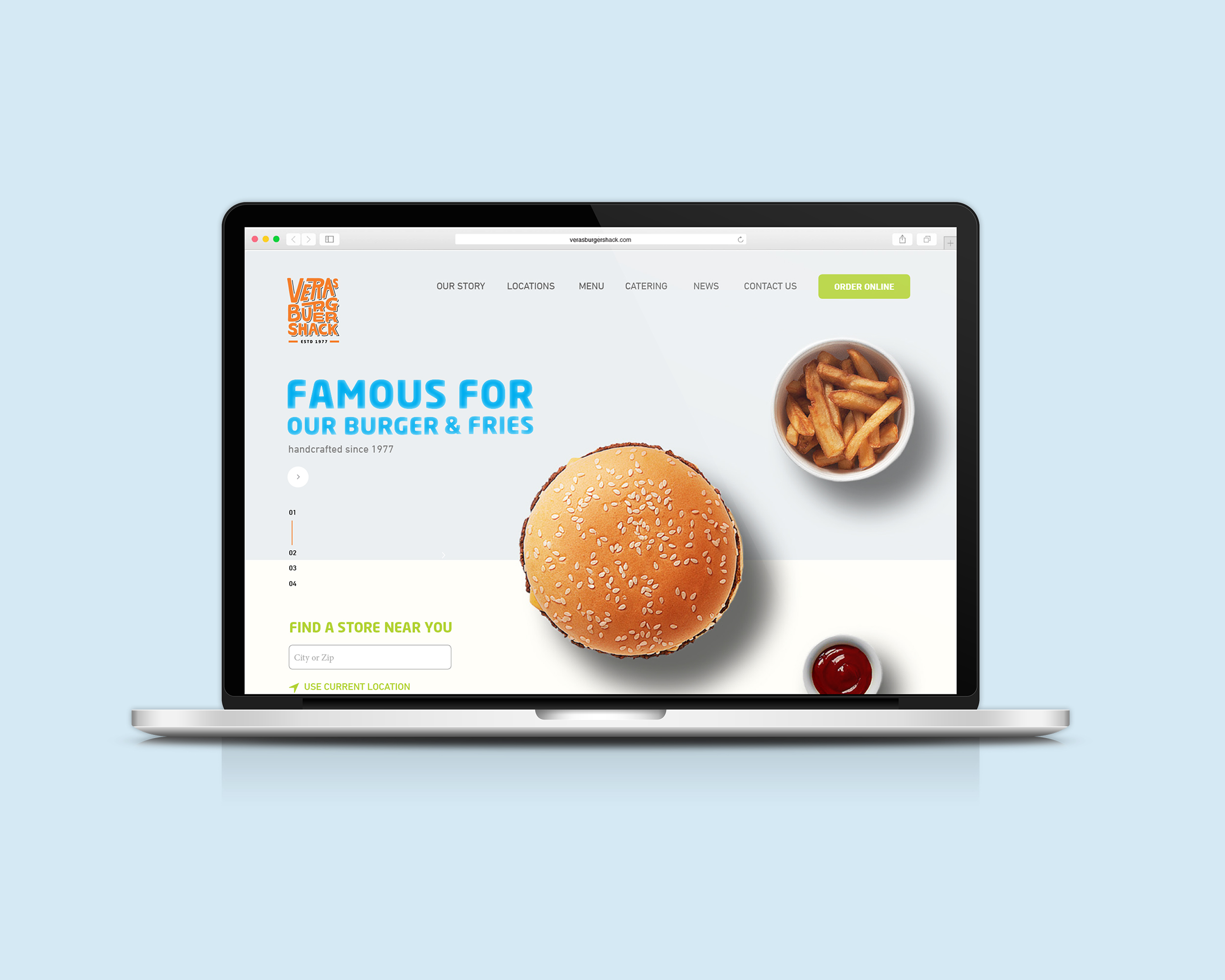
The image projected by current branding is not consistent with the image Vera's wants and needs to project. Vera's Burger Shack not only needs to differentiate itself from local competitors and main stream fast food joints but also needed to build a more consistent and appealing brand that will position them for the next few years as they expand nationally.
The original colour palette (orange and black) is kept through for the logo with the addition of cyan and lettuce green as secondary palette for the new identity. The addition of the bright colours provides the brand with a more fun, youthful and fresh feeling. Off white is chosen to be the background colour to give it more warmth and to balance out the cool colour tones from the secondary colour palette.